[This update on my Twitter cluster visualization project is also the final report for the independent study I’ve been doing on infoviz. I’ll definitely pick up this work again soon, but not in the next couple of weeks. A previous post with some of my early tests and rationale is here. A walkthrough on how to get started making these is here.]
For the past few months I’ve been absorbing lots about information visualization, and in the past four weeks I’ve been doing a bunch of work specifically on visualizing clusters based on the Twitter network. The goal of this is described in a previous post. Along the way, I’ve learned a weird bunch of other things: tuning MySQL performance, the advantages of the Google Social Graph API over the Twitter API, how to get around the fact that many of OCAD’s lab computers are still running OS 10.5, how to make a screencast, etc. I want to take this work in a bunch of other directions (and will, once I’ve dealt with my other deadlines). Here’s some of the more interesting maps that I produced along the way:
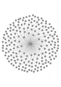
Simply the people I follow. (193 nodes, 192 edges):
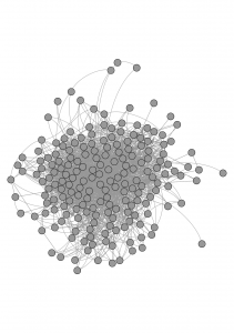
The people I follow, including the links amongst them (193 nodes, 2813 edges):
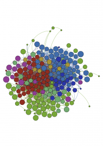
The same data, but now with clusters identified:
There are 7 “communities,” which correspond (awkwardly!) to these real-world communities: art/foresight/big data; toronto; toronto tech; cfc/ocad; vancouver/montreal/academics; social innovation; other.
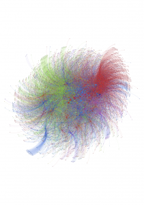
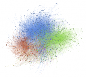
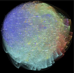
Now we go larger — 6528 nodes and 30599 edges. Which is everyone I follow, and everyone they follow, but filtering out those who are followed by less than two people in the rest of the network. This is where the built-in clustering algorithm in gephi starts to sturggle: it identified 103 clusters:
This is the same data, but those with fewer than 3 followers in the network are filtered out, as is any user with more than 4000 followers (from anywhere, not just this network). The number of clusters came down to 30. 2674 nodes, 14376 edges:
Same idea, but this one with tighter constraints: the “In Degree” had to be at least 2, and it excludes anyone with more than 2000 followers. 4061 nodes, 11667 edges, 402(!) communities:
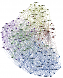
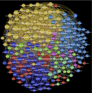
I tried it out on others’ networks. Here’s one; just direct followers. Labels too! (150 nodes, 2440 edges, 5 clusters):
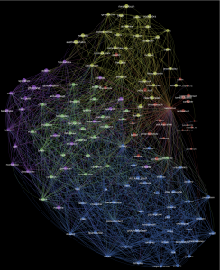
On paper, it looks way better with a black background. Maybe on-screen too?:
And a screencast of it coming together:
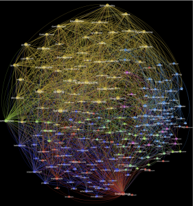
Here’s another, again just direct followers. Two versions (208 nodes, 3013 edges, 7 clusters):
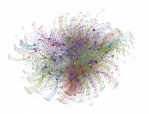
Same data, but this time just nodes where “In Degree” >= 5 (4252 nodes, 34897 edges, 10 clusters):
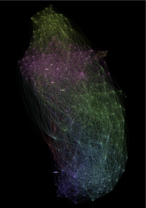
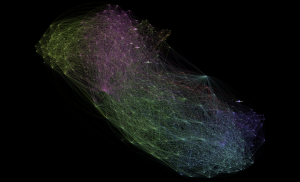
I played around a bunch with making maps of two or three people’s networks at once, to see how closely they overlap. I found it much more difficult to make them legible. Here’s one that turned out ok. It’s all of the people that I follow, and all of the people that Greg follows. 568 nodes, 11732 edges, 8 communities. Node size corresponds to the number of followers that person has. Two versions, same data, just a different rendering (there’s an element of randomness to the process):
I also made of screencast of this one:
In his presentation at Strata about prototyping with data, Tom Coates from Nokia said that through experimentation (play?) and prototyping, you “start to develop a colloquial understanding of the data…” which is very valuable for when it comes time to develop actual product ideas. I’d forgotten that comment until partway through this work. I was super-proud of my first few maps, but they look really awkward now. Over these few weeks of working with this data, I’ve made progress in figuring out how to handle it in the first place, how to make it more legible, how to make it look better, and, in a way that I can’t yet describe, how it works. I’m not yet at the product development stage, but thankfully that wasn’t the goal.
The places I’ll go with it next are:
- Dig into research on clustering algorithms, and figure out what would be required to tweak the existing clustering method in Gephi, or create new ones which are more suited to large networks.
- Do a bunch of experiments in eliminating nodes with a very large number of followers — these tend to be non-humans (like @TheOnion and @shitmydadsays) or celebrities (like @BarackObama and @ConanOBrien), and I think that since so many people from so many different communities follow them, they might be ‘short circuiting’ the cluster analysis. Experimenting with this would mean either manually identifying non-human Twitter users, or using trial-and-error to see if eliminating users with a large number of followers gives good results. (The cool solution to this problem would be to eliminate just those users who have a large number of followers from a very diverse set of communities. No idea yet how I might determine that.)
- Look into tweaking and writing new layout and styling possibilities with gephi, by creating plugins.
- Automating map creation, using the Gephi Toolkit, and/or a Processing library that’s in development. The two immediate possibilities that this would introduce are:
- Creating a website on which a user could enter a Twitter id and generate a map for them on the fly (or within a few minutes).
- Testing layout or visualization algorithms on a large number of users’ networks. This might be particularly handy for the trial-and-error work required in dealing with celebrity and non-human users.

Pingback: Ideal Syllabus – Digital Humanities