
Last night I spoke at the Toronto Net Tuesday event about visualization for non-profits. Thanks to those who came out, my co-presenter Justin Malecki from ClearSky Advisors, and the organizers, TechSoup Canada. Here are the links I showed, and my notes:
A big pile of infographics: http://www.hongkiat.com/blog/50-informative-and-well-designed-infographics/
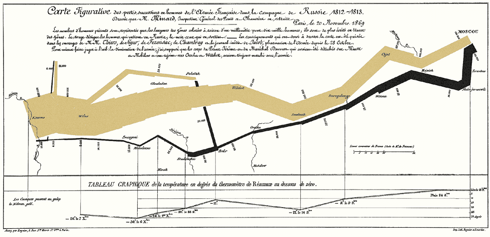
Edward Tufte’s Napoleon’s March: http://www.edwardtufte.com/tufte/graphics/minard_lg.gif
Gapminder (also watch Hans Rosling’s TED talk): http://www.gapminder.org/
Lakes and Oceans: http://xkcd.com/1040/large/
Dangers of Fracking: http://www.dangersoffracking.com/
Periodic Table of Visualization Methods: http://www.visual-literacy.org/periodic_table/periodic_table.html
GE Annual Reports 1892-2011: http://visualization.geblogs.com/wp-content/viz_includes/reports/#y=-1&s=-1&c=2&w=0&i=-1
Capitol Words: http://capitolwords.org/
Where Does the Money Go? by Stamen Design: http://migration.stamen.com/
So, why do we like visualization so much?
- it helps us understand
- it helps us communicate
- it helps us handle complexity
Or in other words:
- it’s a way to figure stuff out
- it’s a way to tell stories
From my perspective, those are the two main categories of viz. Do you want to figure stuff out, or do you want to tell stories?
There’s overlap, obviously. But all the stuff we’ve looked at falls primarily into the second category: telling stories. (Normally when you’re doing viz to figure stuff out, you don’t share it until you’re telling stories about it.)
Watch out for oversimplication in visualization:
American Red Cross infographic: http://philanthropy.com/blogs/innovation/nonprofit-data-visualization-a-gallery/667/2011disastersinfographic
And watch out for misinterpreted or misunderstood (or just confusing) data:
Statistics Canada’s Power From Data: http://www.statcan.gc.ca/edu/power-pouvoir/ch6/misinterpretation-mauvaiseinterpretation/5214805-eng.htm
To get started with visualization, all you need is:
1) some data
2) a question to ask or a story to tell
You don’t need tools that you don’t have. The best tools for visualization are the ones you already know: Excel (or another spreadsheet) and Powerpoint (or another presentation tool). Down the road you might also want:
3) a graphic designer
4) a statistician
There are lots of online tools that offer “free visualizations.” I haven’t looked at all of these, but they’ll only be useful to you if the kind of visualization that these tools produce are the ones that your story or question requires.
Finally, managing your data is hard. Ensure that your data is organized and accessible, and ensure that you have a system to keep track of different versions. (If you’re looking for a new way to do this, check out BuzzData, a clever Toronto startup.)
— stuff that wasn’t in my talk —
Some other neat examples of simpler infographics:
http://www.corporateknights.com/article/infographic-historical-average-annual-american-energy-subsidies (look how little data there is!)
http://virtualwater.eu/
Awesome data visualization video from Kiva:
http://vimeo.com/31116244
A book which I haven’t read but looks like an excellent primer on visualization for non-profits:
Visualizing Information for Advocacy: http://tacticaltech.org/visualisingadvocacy
Relevant talks:
Jer Thorp’s TED talk: http://www.youtube.com/watch?v=Q9wcvFkWpsM
Code for America’s Big Data for the Public Good series: http://www.greenplum.com/code-for-america
Visualization galleries:
http://flowingdata.com
http://www.informationisbeautiful.net/
http://infosthetics.com/
http://www.good.is/infographics
http://www.visualcomplexity.com/
Other resources:
vizthink.com
datavis.ca (Michael Friendly, York)
The Back of the Napkin (another book I haven’t read)
A few neat free tools:
Many Eyes: http://www-958.ibm.com/ (example: http://www-958.ibm.com/software/data/cognos/manyeyes/visualizations/movie-genres-1888-2012-count)
Tableau Public: http://www.tableausoftware.com/public (example: http://public.tableausoftware.com/views/geographyofdiabetes/Dashboard2?:embed=yes&:toolbar=yes)
OpenHeatMap: http://www.openheatmap.com/
Wordle: http://www.wordle.net/